GOFIND MOBILE APP - CASE STUDY
Designing for Artificial Intelligence

Gofind?
A shopping app for fashion.
Bridging the gap between influencers, stores & shoppers.
An early stage startup.
For who?
Millennial shoppers.
How?
Via a mobile app.
Powered by Artificial Intelligence.
PROCESS
Taking the existing
design to the
next level
When I came to GoFind they have had designers working on the product prior to me. I was tasked with taking the existing designs to the next level in order to be able to ship a minimal viable product (MVP) to the App stores as soon as possible.
Reviewing the inventory
I started out with reviewing and organizing the design assets to see what we could use moving forward and what needed to be created from scratch.
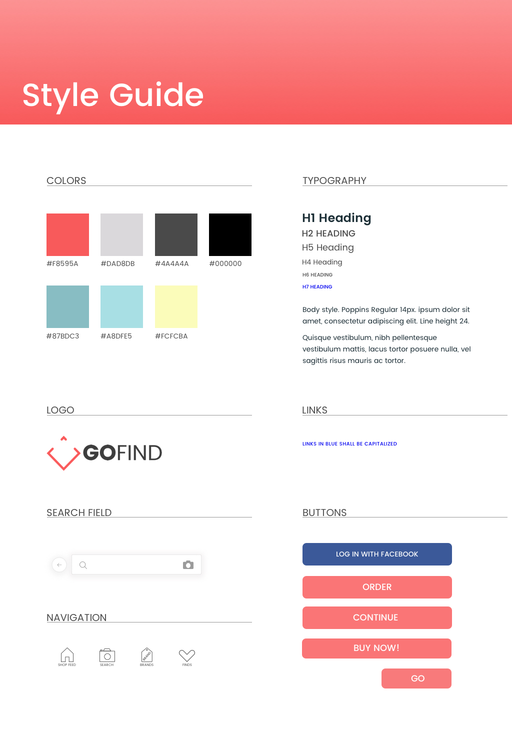
One of the first things I created was a style guide since that didn’t exist. It would be helpful to keep a consistent design and ease the work for the developers if they had the assets and measurements all in one place. As more designs were being created we could make sure to follow what was set for the brand in terms of colors, typeface etc.
INFORMATION ARCHITECTURE
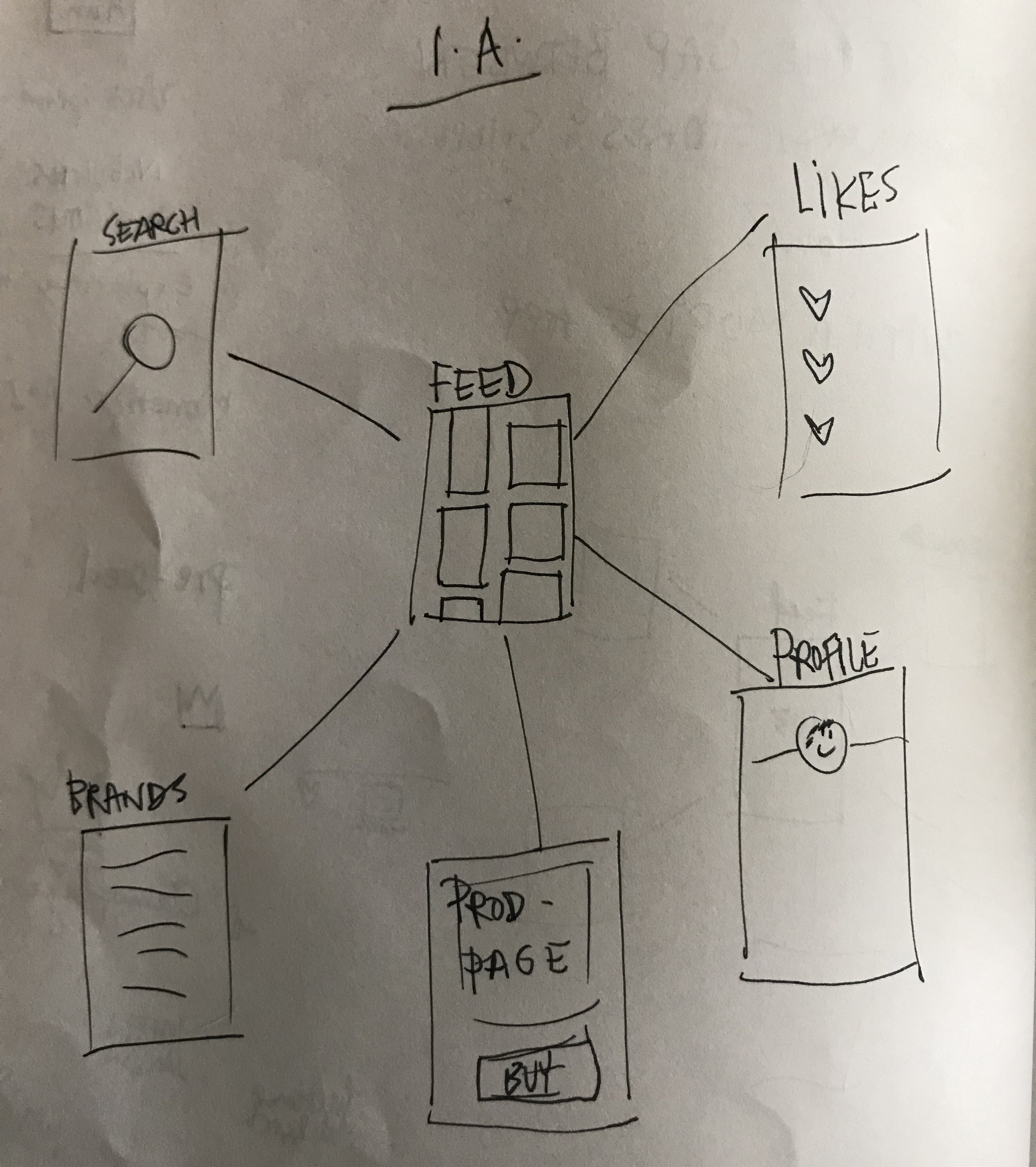
Hub & Spoke structure
How to structure the main features of the app:
Visual Search - Feed - Add Post - Product Page - Likes - Profile
Since the feed was the main focus of the app, and where users would land when they open it, I thought it made most sense to go with a hub & spoke structure for the information architecture.

Millennials
RESEARCH (TO INFORM DESIGN)
Research Methods
Competitive & comparative analysis, guerilla surveying, deep interviews, online research
Getting to know the users
Gofind wanted to target Millennials (generally speaking people born from 1980 to the early 2000’s) with its services. After all, the so called Generation Y is the largest generation since the baby boomers. They are also known for being digital natives, which fits the target group of an app-only brand.


Insights - Well-funded & demanding generation
PRICE-CONSCIOUS SPENDERS
influencers BEFORE brands
WOW ME!
According to Accenture, by 2020 Millennials are projected to spend $1.4 trillion shopping every year. That might seem like a splurge—but according to my survey, Millennials are actually very thrifty and price conscious. One factor could be that I surveyed a lot of University students.
Many articles address the lack of brand loyalty among Millennials. My interviewees also expressed that style was more important than brand. They make purchases on their smartphones and more likely to be influenced by product reviews by peers and trusted influencers. Millennials want to be wooed by companies and showered with exciting offers and coupons.
Feed - Hub of the app
I led brainstorm
UX formula for AI
THE PRODUCT FEED
I was tasked with designing the product feed—where users spend most of their time. Here, they discover new products, "like" items, shop, and discover new brands.
The CEO wanted to create a personalized shopping experience. According to Smart Insights , 48% of consumers spend more when their experience is personalized.
Personalization
In order to customize the experience, I led a brainstorming session with the other UX designer on the team. I thought it was a good idea to have someone else to bounce ideas off. We worked out elements—like product tags, demographic data, and use cases—that could affect a user’s feed.
After our brainstorm, I mapped the list of actions to the user priorities I uncovered in my prior research. I delivered the results of this process—the UX formula for the personalization—to the data scientist and AI engineers as a “secret sauce” input for their creation of the personalization algorithm.
We weighted certain actions differently, like searching for certain products, liking a product, clicks and so on, according to user and business requirements.
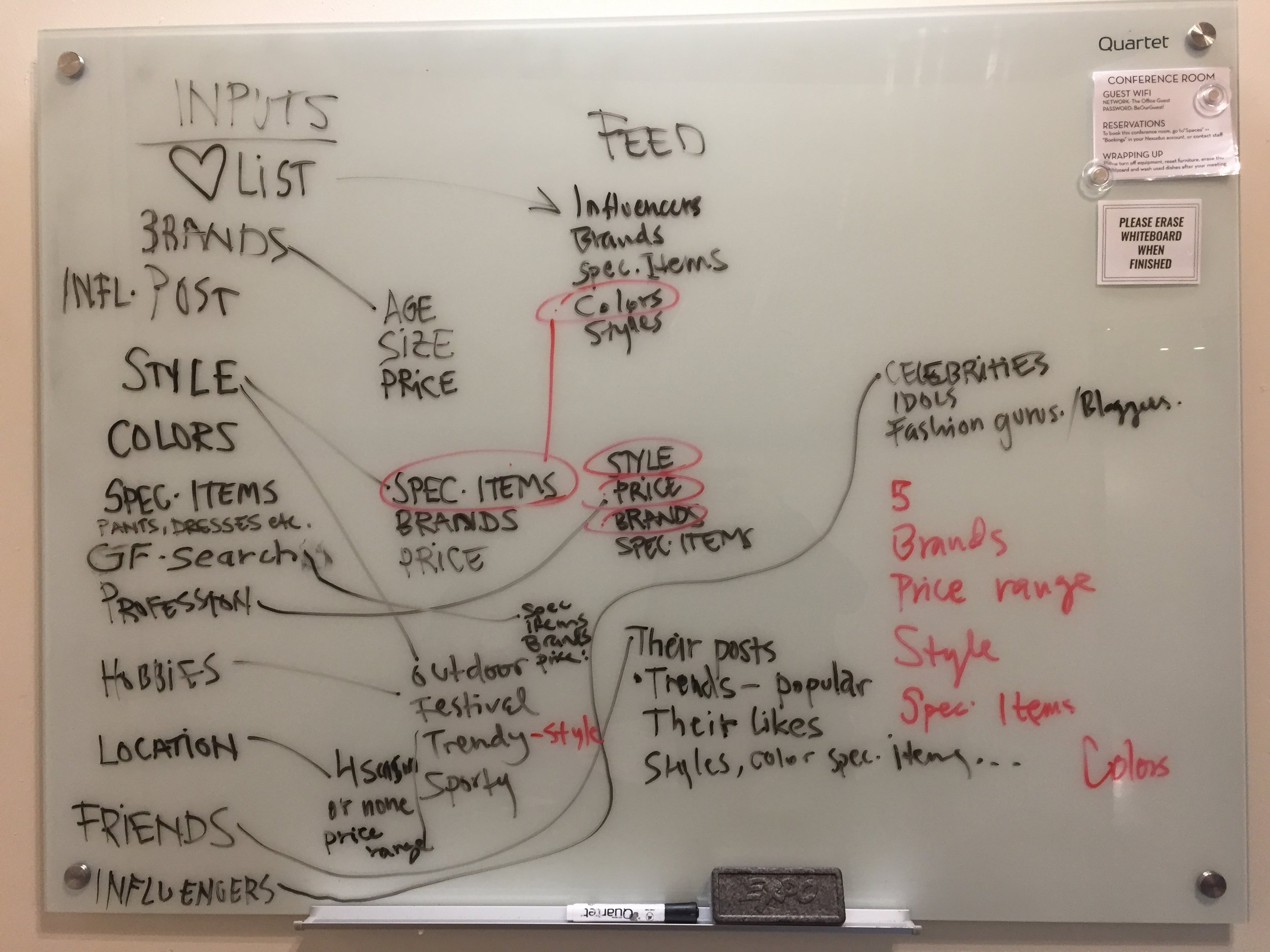
Brainstorm on whiteboard
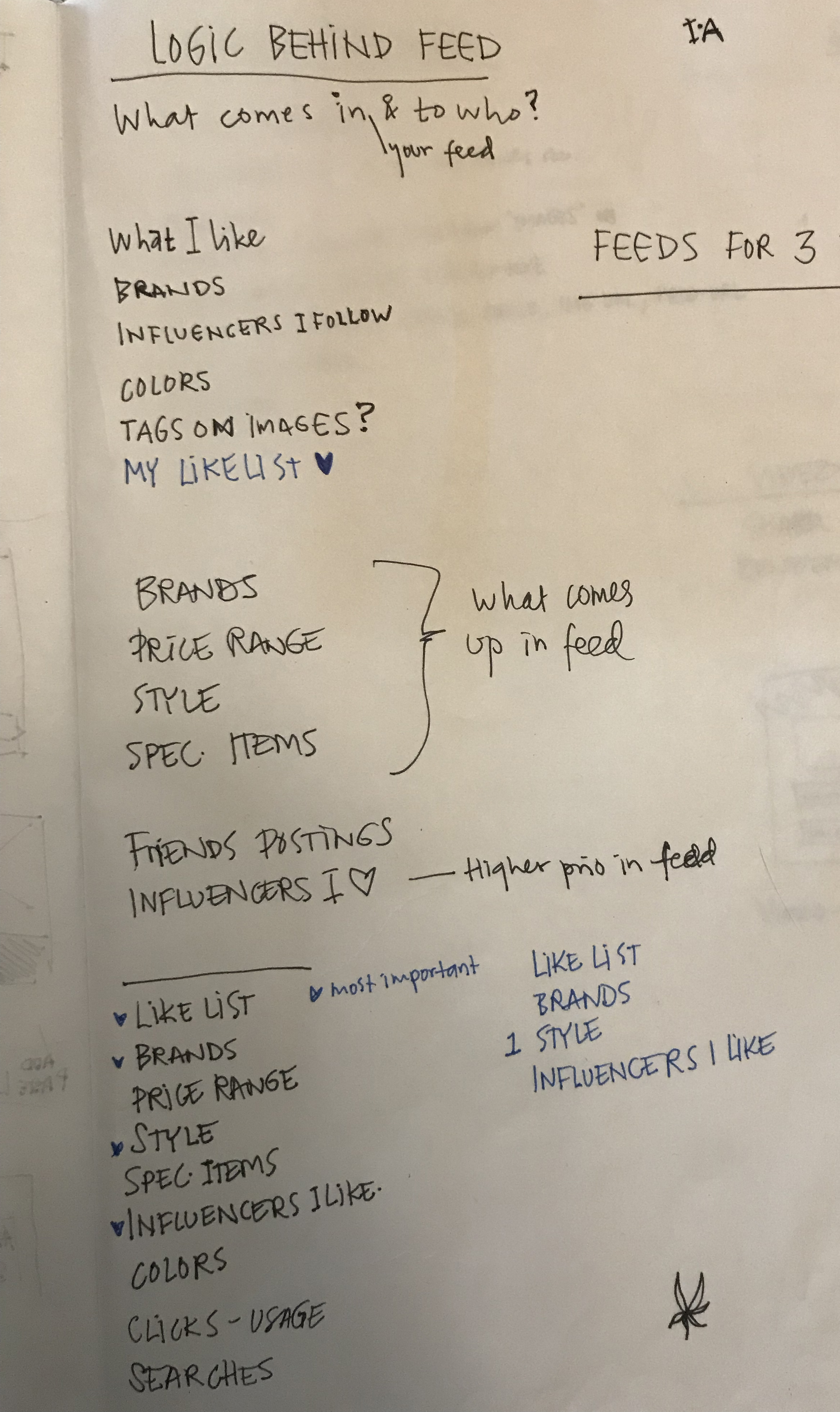
Refining the brainstorm
The looks and feel
Since the products were the limelight of the feed I wanted to go with a minimal, sleek design. I thought a crisp, white background would let the items speak for themselves and minimize visual clutter.
Gofind is an aggregator and therefor would present products from a multitude of brands. There would be no standard in sizing of images in the feed. Talking to developers we could do on a fixed width and then let the image stretch as far as needed to not distort the image.
Below you can see some of my wireframes explorations of the feed.
Image layout options

Random sizes of images, too chaotic visually.

More locked in sizes, too rigid and would distort images and cut off content. Visually too static.

Final wireframe with staggered images, flexible length.
feed - final design
FINAL DESIGN FEED
Feed features:
Crisp white background
Prices - My research showed that millennial shoppers are very price sensitive.
Staggered layout to create visual interest and a feeling of infinite scroll.

FINAL THOUGHTS
When I started at GoFind, the founder and CEO wanted to create an MVP and ship it to the app stores in order to start fundraising. Over 5 months, I helped take the design to the level of shipping and functioning.
In this project, I learned to be creative with few resources, as well as an ambiguous and developing roadmap. I learned a lot from working closely with A.I. engineers, data scientists and developers.
Ideally I would have stayed longer with the project to get feedback from actual users and work on further iterations, but the company relocated to Canada.