Bluescape - Admin console redesign
Bluescape is an enterprise collaboration tool (similar to Miro or Mural) that enables real-time collaboration in a unified workspace. With Bluescape, teams can work together simultaneously on the same content, regardless of their location or devices.
My role
Lead UX Designer
TEAM
3 Product Managers
2 Engineering teams
Timeline & Process
10 months
UX Design process
Agile
Background
Upon joining the company, a decision had already been made to rebuild the legacy administration console, and initial design concepts were in place. However, it was my responsibility to take charge of the complete redesign project and deliver high-fidelity screens.
Admin Console
The admin console serves as a centralized hub where administrators can efficiently manage platform setup, user accounts, configurations, roles, and permissions. This essential tool is accessible to both external customer admins and Bluescape's dedicated customer support team.
Problems
Admin tool + User Portal in one place
The Admin users are not necessarily users of the product
Responsive design
Some pages did not work responsive
Odd scrolls happening
Content disappearing on certain screen sizes
Inconsistent UI
Various types of Call to Action (buttons etc)
Misleading nomenclature
Scalability
An Enterprise product needs to be able to scale
It needs to work for 30 and 30,000 users
Limited filtering and search functionality
solution
A brand new admin console
Updated and consistent UI & UX
Design based on Googles’ Material Design system
Page templates for consistency
Streamlined information architecture
Flat architecture, increased searchability and findability
Scaleability
Increased self-service capabilities
Responsive design
Admin users
The people that are using the admin tool are not necessarily users of the collaboration platform. They are both external customers as well as internal employees at Bluescape. Users of the admin tool are assigned roles and therefore have different levels of permission in the system.
The new and improved admin console was designed for two personas:
IT Admin and the Bluescape’s Support Agent
Since the Support Agents were in-house I conducted deep interviews and kept a continuous feedback and input loop with the team.
Insights
The users of the admin tool are highly technical and task driven individuals. They work under pressure so the need for simplicity and speed is crucial. They are solution-oriented problem solvers that wants to figure out things on their own.
Design Goals
Together with the insights of my user research and other related research, I came up with three design goals that I wanted my design to achieve.
Design goal that is based on the user needs.
Fast
For the need of getting jobs done in a timely matter.
Consistent
No cognitive overload, same behavior.
Clear
Overviews, lots of data, searchability & findability
Information Architecture
The information architecture had grown organically and without a user-centric strategy. Therefore, I saw the opportunity to rearrange the content and pages.
Simplifying
Separating the user portal from the admin tool.
Consolidate pages by relocating related content and features onto a single page.
Revise the hierarchy based on user needs and incorporate new pages accordingly.
Modular design
I created 3 types of pages that could be utilized in many different contexts. By repeating the same patterns and behavior you create an intuitive design and reduce the cognitive load for the user.
Tables
Presenting lots of data in an easy-to-scanable way. Search and filter features help with findability. Accordions that reveal layers of details.
Cards
Displaying content and settings that are easy to scan and update.
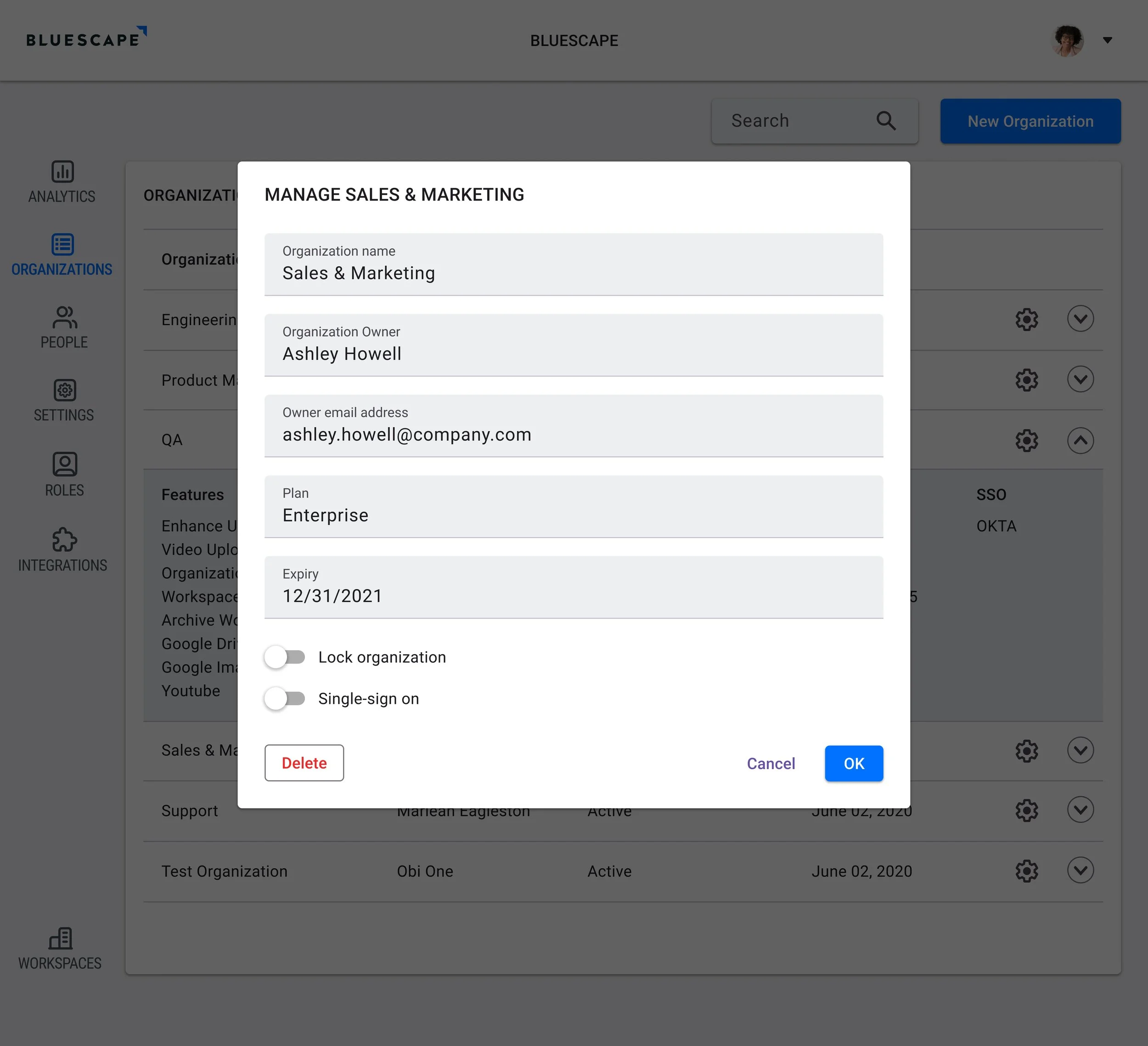
Modals
For updates and changes to the UI without leaving the page.
Final design
A Table page with one accordion open.
An edit Modal where the user can review and edit information.
A Cards page where user can review information and take actions.
outcomes
A streamlined Configuration Tool:
Enhanced usability for admin users and the internal support team.
Improved information architecture for easier navigation.
Added self-service features for greater convenience.
Enhanced UX & UI Design:
Total overhaul resulting in a responsive and intuitive interface.
Simplified user flows and consistent behavior for smoother interactions.
Scalable Product:
Increased user control and capabilities.
Supports rapid company growth.
Optimized for large sets of users.


