Palo alto research center - case study
proof of concept for energy saving transportation service
Overview
Palo Alto Research Center (PARC) wanted a proof of concept for their Collaborative Optimization and Planning for Transportation Energy Reduction (COPTER) project. The POC was going to be presented at the Clear Energy Ministerial in San Francisco (www.cem7.com). CEM 7 is a forum where energy ministers from all over the world focus exclusively on transitioning to clean energy.
My Role
UX/UI designer & Visual Designer. I collaborated with one of the senior research staff members at PARC.
Challenge
Create a cohesive look for four very different use cases. Design high definition wireframes and a working prototype for a complex product in the short timeframe of two weeks.
COPTER - Collaborative Optimization and Planning for Transportation Energy Reduction
Transportation accounts for more than 25% of total energy consumed in the United States. Efforts to minimize energy use have predominantly focused on improving vehicle fuel efficiency and expanding use and availability of public transit. However, other factors impact transportation energy use such as traffic congestion, stop-and-go traffic, and limited information on available routes.
PARC's system could help reduce congestion in metro areas without requiring investment in new infrastructure. The COPTER system will identify the energy-efficient routes most likely to be adopted by a traveler. It could facilitate a reduction in transportation energy use and help reduce demand for imported oil. More efficient transportation networks will minimize energy consumption, resulting in improved air quality and lower greenhouse gas emissions.
In this proof of concept the use cases are all applied to the area in and around Los Angeles, CA.
Process
"I can make it like a prototype for an app"
PARC presented four different use cases from the COPTER system that they wanted to visualize for their audience in an iPad App. My thoughts was to bring the various use cases together into a cohesively designed environment. This design would be easy for the PARC employees to navigate and use as presentation, while also remaining easy for their users to understand.
Colors and pattern
When selecting a suitable UI pattern I looked for something neutral and in the blue hues that I have seen PARC use in their style guides. I knew that I wanted to keep the visual design clean and simple to not distract from the content, but relate to the brand.
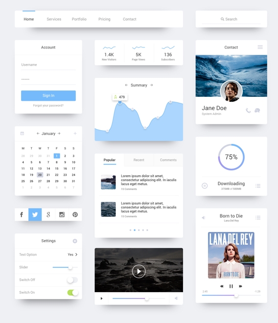
Clean, neutral and sleek UI pattern
PARC'S colors from style guide.
My color choices
Four different use cases in one app to showcase the capabilities of the COPTER system
First Use Case - City Monitor
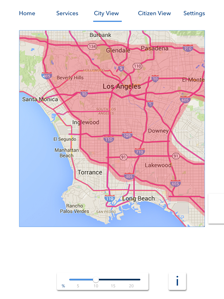
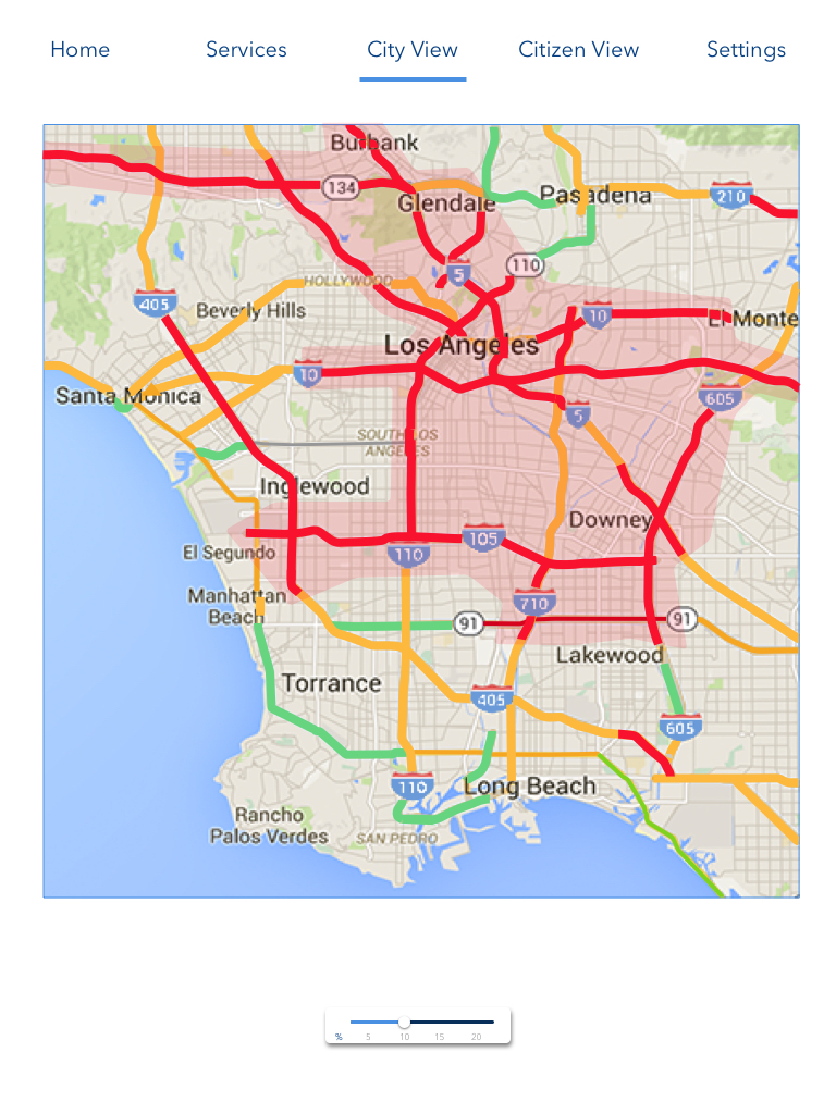
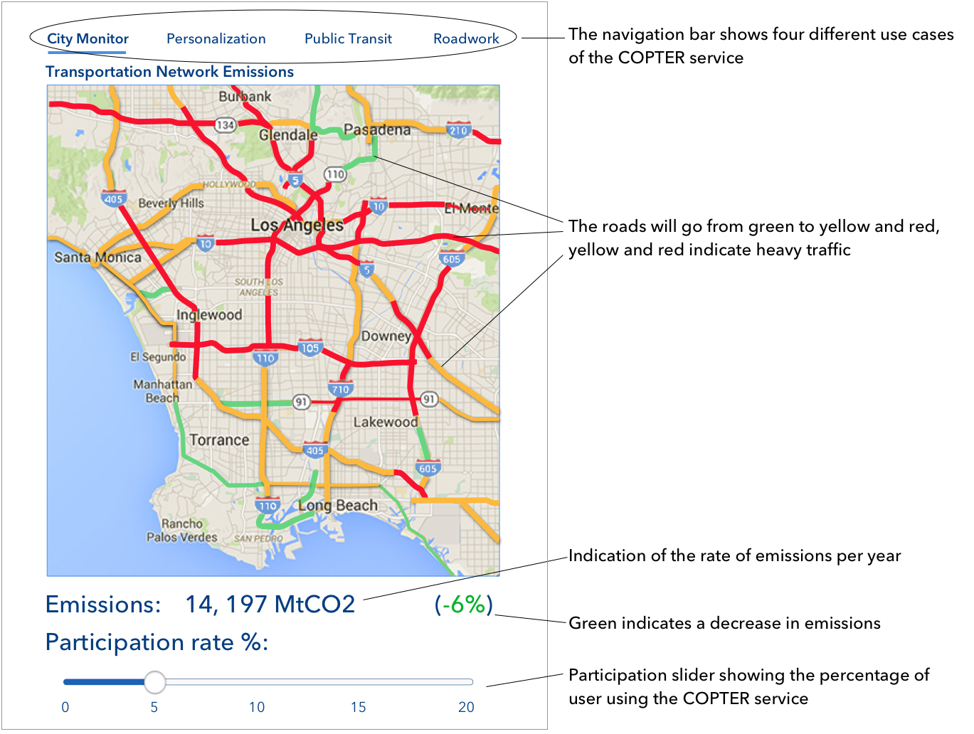
In the first use case, we look at how the traffic congestion and emissions from the main highways in the Los Angeles area will change due to the percentage of individual commuters usage of the COPTER service. This view would be helpful for a government officials such as city planners or politicians.
In the above example we see a participation rate of 10% of COPTER users. We see positive emissions rates (indicated in green color) and the effect of the traffic indicated by the colors of the road. Where green is low traffic and red is high traffic.
Design process
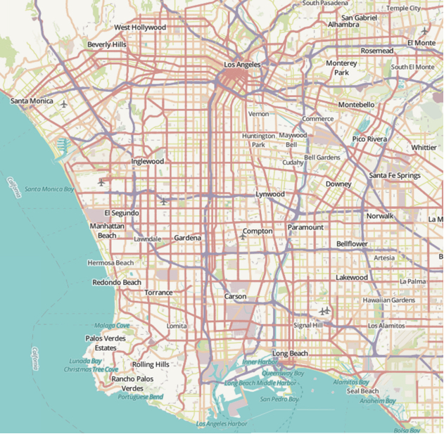
PARC wanted to illustrate in a map view how the traffic was affected by the usage of their COPTER service. I compared Open street maps with Google maps and I found Open street maps to be busy and would not work for the sleek look I was going for.
The Open Street maps are busy and lack contrast which makes it harder to look at.
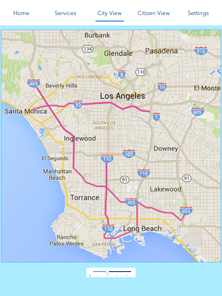
With Google maps users can more easily focus on the main road network without too much distractions.
Our next design problem was to show how COPTER’s simulation functionality might show changes in traffic patterns and emissions.
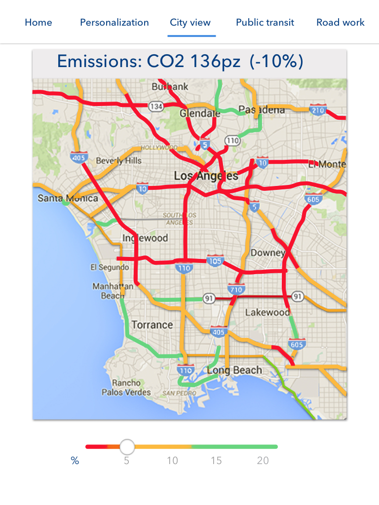
I explored different design options on my own and through collaboration and feedback from PARC. We agreed on a design where the roads are colored yellow and red to indicate a higher traffic impact and green for no or lower traffic. I'm using conventional colors to make the design intuitive.
COPTER can show small effects to traffic and emissions. I decided on a slider so users easily and quickly could see those changes.
I chose the last iteration #7
After a couple of iterations the final design resulted in the following.
Roadwork
In the second use case, we explore the potential effects a construction schedule could have on traffic and emissions. This is a view that can be very helpful for government or city officials that are planning roadwork or other obstructions to the roads. Through simulation, by choosing the type of obstruction, time and dates they can avoid the worse case scenarios.
Since I had already designed the global navigation and the map view we were on a good pace with the continuing work on the Roadwork use case. Time management was crucial in this project due to the expedited timeline. In order for the user to choose duration, I added a date and time selector as well as a dropdown list to pick various roadwork obstructions from.
Third use case - Public Transit
Public Transit is the third use case where we can simulate the effects of changes in public transportation and the impacts that they can have on traffic and emissions. This is also a feature that would help a city planner or other government official in making their decisions.
This use case mimics the other ones in that we do not see a map view, but instead of emissions we look at energy usage. In this example we look at how this impacts frequency of the Metro Red Line.
Final use case - Personalization
Here we look at commuter personas and how they can (by making slight adjustments in their commuting routine), save energy, lower emissions and improve the overall traffic flow.

