QUAY AUSTRALIA - CASE STUDY
UX Consulting for e-commerce company
Images from Quay Australia
OVERVIEW
Quay Australia is a trendy sunglasses brand with a global e-commerce site.
Short-term contract role creating User Experience strategies for implementation of personalized recommendations & a virtual try-on experience.
MY ROLE
UX Designer. I worked closely with the Sr. Director of e-Commerce & Marketing, Web Developer and Sr. Brand Manager at Quay.
Problem
Quay Australia needed guidance on where and how to place two third-party applications on their site. One that gives personalized product suggestion and another that makes it possible to virtually try on the Quay sunglasses.
Deliverables
Strategies and mockups for where and how to implement the applications.
UX Audit with suggestions for improvement of the user experience on the website.
process
Research & Discovery
Initially, I needed to familiarize myself with Quay Australia’s site and products. They have a responsive multi-regional (and multilingual) Shopify e-commerce site. I discovered a number of usability issues I felt should be addressed with Quay, even though they were outside the initial project scope. I did a short UX audit and presented the findings to the stakeholders.
Past research had shown me that personalized recommendations and advertisements can be very powerful. According to Invest (a Conversion Rate Optimization company) 59% of online shoppers believe that it is easier to find more interesting products on personalized online retail stores. 45% of them are also more likely to shop on a site that offers personalized recommendations.
Users respond very positively to accurate recommendations. Inaccurate recommendations can have a very strong negative reaction. So, Quay’s decision to use a 3rd party application that specializes in personalized recommendations was a good one.
Competitive & Comparative Research
I looked at major retailers and popular eyewear companies to see how they worked with recommendations on their sites. I also looked at their nomenclature. Even though Quay has their own copywriters, I thought the team might be able to reference my findings in their work.
Studying other e-commerce sites
Mapping nomenclature
I studied the home, category, and product pages since those were the ones I was focusing on for Quay. I started to see some patterns in how these companies used recommendations on their websites.
Home pages
Recommendations were placed beneath the hero image or a bit further down on page. Labels for recommendations tended to be: Trending now, Campaign, or New Arrivals.
Category Pages
Not all companies’ category pages had recommendations. When they did, they were called: Campaign, Hot releases, Most popular.
Product Pages
Recommendations are used frequently and sometimes subsequently on Product pages. There, recommendations are categorized as: People also viewed, Similar items, Customers also loved, Frequently bought together, Consider these popular items, Recommended, and such.
My Suggestions for Placement on Home page
With the insights from my research I came up with the solutions for Quay’s pages. For the Home page, I suggested that Quay Australia place personalized recommendations high up on the page, under the hero image. You want to put something users think is positive above or as close to the fold as possible. According to Nielsen Norman Group, users’ spend 80% of their viewing time above the fold. A carousel would allow users to browse more products and also give Quay flexibility in customizing the number of products to present.
Top part of Home page Web & Mobile
Recently Viewed - Repetition to Drive Conversion
The marketing “Rule of 7” says that a customer needs to come across your offer at least 7 times before they take action. Therefore, I suggested that Quay should present users’ most recently viewed products at the end of product pages they visit. For the usecase when their is no browse history I suggested showing popular items or selected products they wanted to promote.
Recently viewed placed above the footer (images from Quay Australia)
Virtual try-on
To sell more sunglasses, Quay wanted to make their online customers’ shopping experience more fun and accessible by adding a 3D virtual try-on experience.
This solution also addresses a large pain-point for online retailers: returns. Around 30% of all products ordered online are returned. In clothing sales, the main reason for returns are fit issues.
Implementing Ditto
Quay chose Ditto to deliver a 3D virtual try-on experience. After a 2-step flow, users can see themselves onscreen, wearing Quay sunglasses they select.
I was provided with the product specs from Ditto and a company that already had the product installed on their site as a reference. The Ditto package included a separate try-on page where users could learn about the feature and get started.
Go Big on the Home (page)
Since this was a new and technically advanced feature, I thought it would be great to make a big homepage announcement. I suggested a hero banner as one of the three carousel images at the head of the home page.
My home page mockup (img from Quay Australia)
The call to action “learn how” would take the user to the virtual try-on page.
Ditto on Category Pages
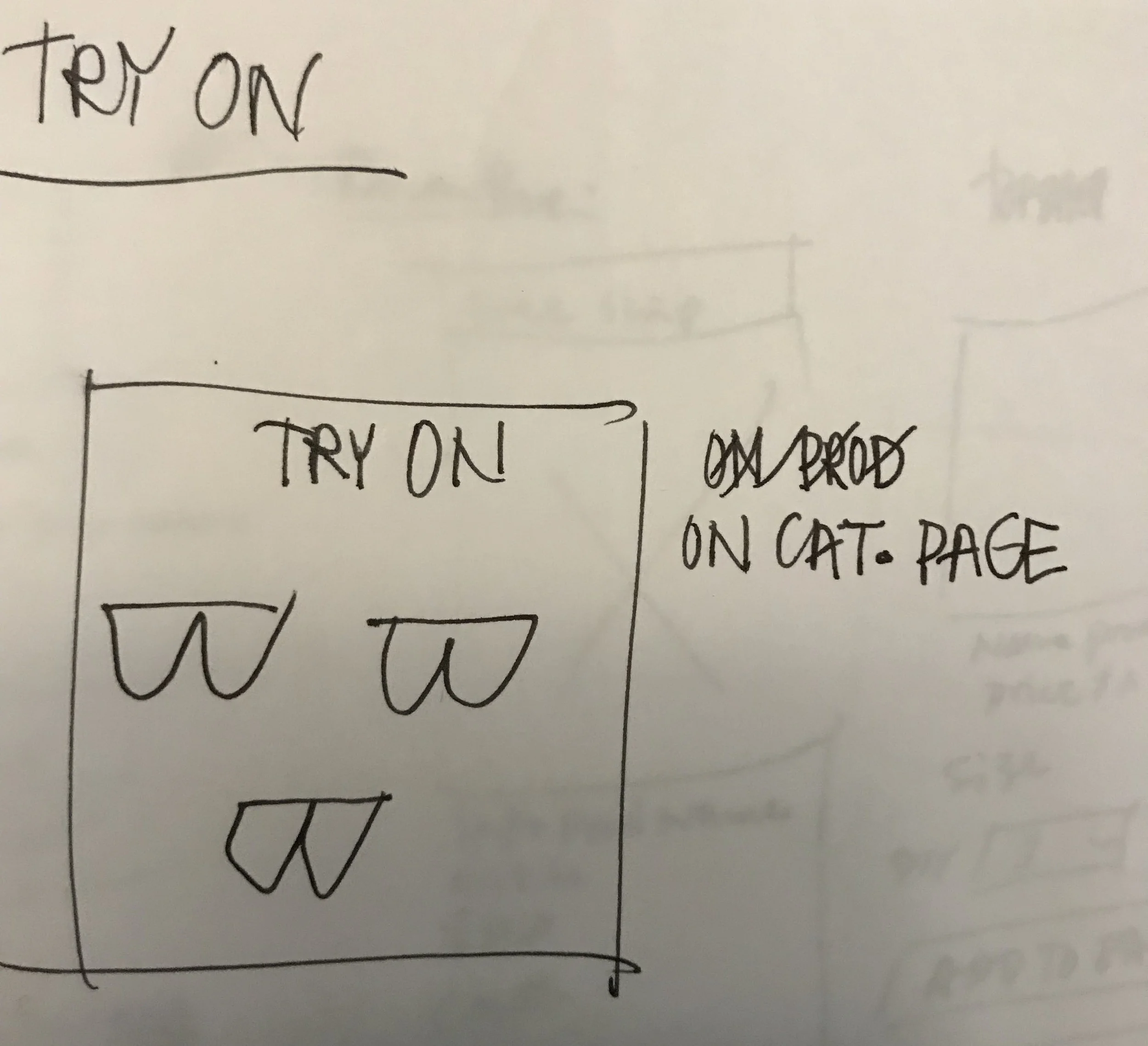
I pitched the idea that Quay design a series of small creatives that could simultaneously advertise the try-on experience as well as their products. This would also help visually to break up the repetitive patterns of rows of products on the category pages.
My sketches for creatives
Screenshot from Quay Australia with my creative for virtual try-on
Product Page - Call To Action
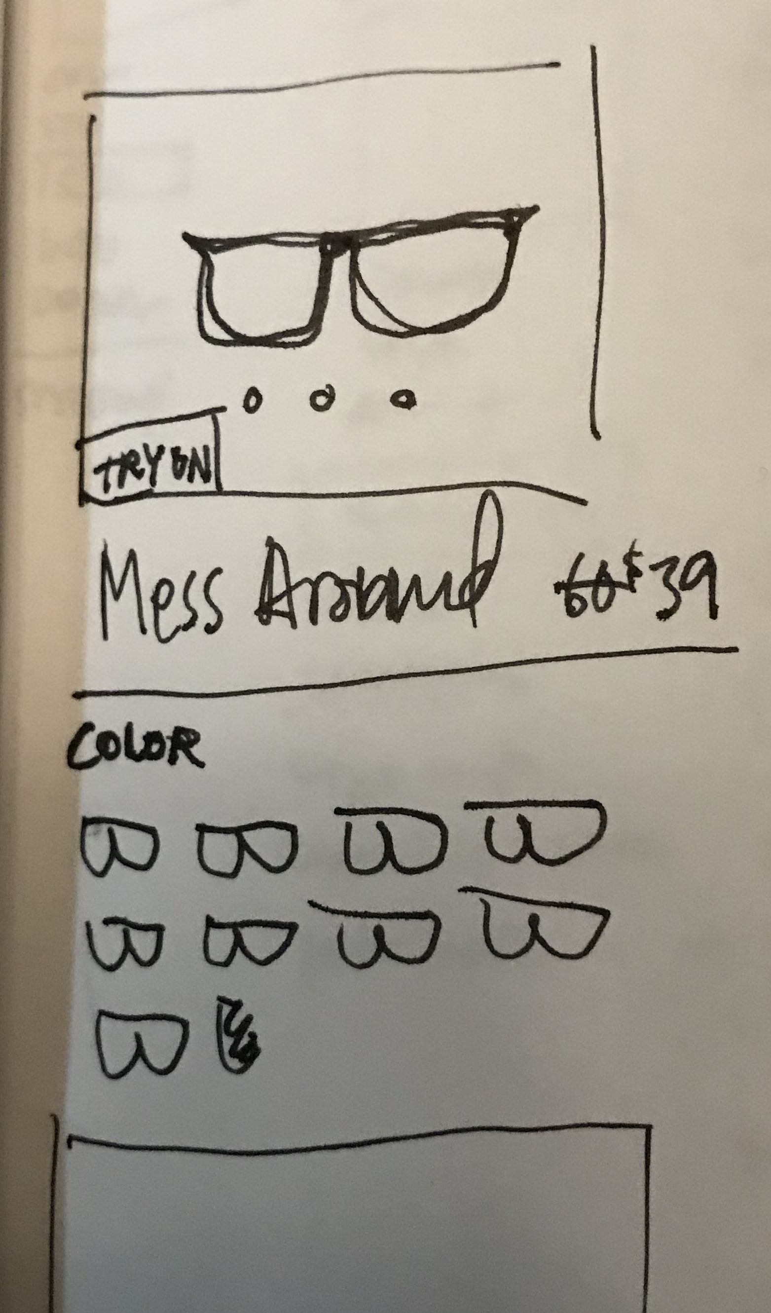
I studied the way other companies in the space implemented services like Ditto and sketched out some possible variations for Quay.
I sketched out some ideas. Being able to visualize my thoughts helps me refine them. It ultimately helps me communicate these ideas to stakeholders too. I got feedback that Quay wanted to go with a button CTA.
The drawing that I continued to work on for the product page
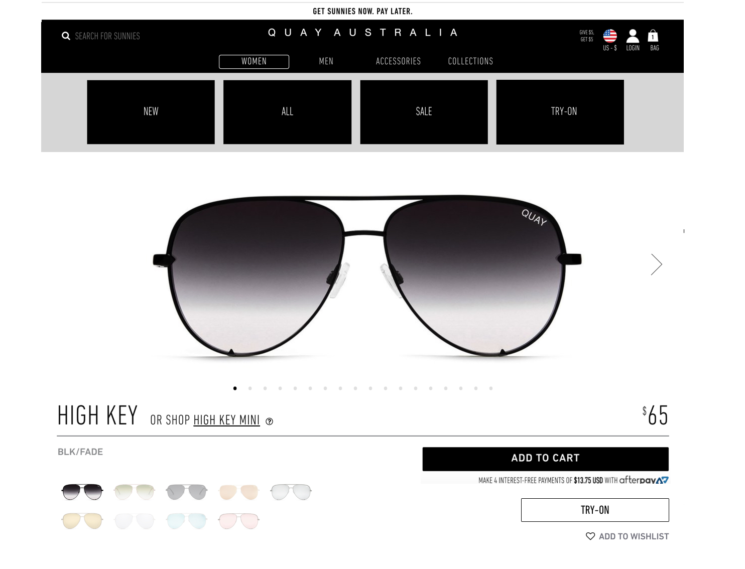
My mockup of product page (images from Quay Australia)
Information architecture
Initially, I suggested they put the link to the Ditto page in the global navigation to drive interest, but Quay had planned changes for their navigation already in the pipeline, so we agreed on adding it to the sub-navigation.
Closing Thoughts
Quay Australia didn’t have a UX Designer on staff, so UX wasn’t a part of their process. Discussing UX principles as applied to their website was great opportunity to educate and socialize the potential that this field has to impact business.
I would have liked the chance to validate the project’s design implementations with users, but my engagement with Quay was limited. It also would have been interesting to see data on results of these changes.
As an influencer brand, Quay’s community is very strong, with thousands of reviews and 1.6 million Instagram followers. This passionate user engagement represents a huge opportunity for the company to make a successful feedback loop of empathy, design and implementation.


